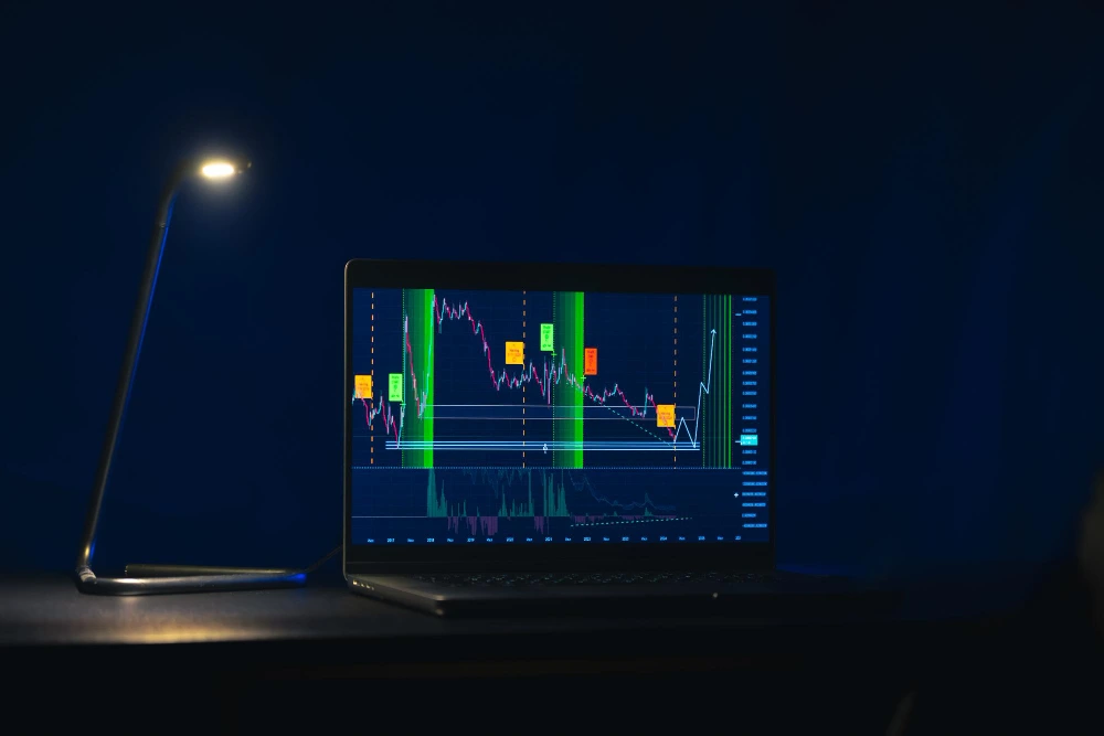
Line charts and candlestick charts are the two most common ways to visualize price movement. Most beginners start with one without fully understanding what information each chart actually shows. The choice of chart type affects how you interpret trends, volatility, and market behavior.
Understanding line chart vs candlestick charts helps you choose the right visual tool based on clarity, purpose, and experience level.
Understanding Line Chart and Candlestick Chart
Both charts display price over time, but they do so very differently.
A line chart plots a single price point for each period, usually the closing price. These points are connected to form a continuous line. The result is a clean and simplified view of price direction.
A candlestick chart shows four prices for each period: open, high, low, and close. Each candle visually represents how buyers and sellers interacted during that timeframe.
Line charts emphasize direction. Candlestick charts emphasize behavior.
When line charts are useful?
Line charts remove noise and distractions.
They help beginners focus on overall trend direction without reacting to intraday volatility.
Line charts are often used for long-term analysis and macro views.
When candlestick charts are useful?
Candlestick charts provide richer information.
They show volatility, momentum, rejection, and sentiment within each period.
This makes them more suitable for timing entries, exits, and risk management.
What beginners should know?
Neither chart is better by default. The right choice depends on what you are trying to observe, not on complexity.
Line Chart vs Candlestick: Key Differences
The differences affect interpretation and decision-making.
Information depth
Line charts show one data point per period. Candlestick charts show four data points per period. More data allows deeper analysis, but also adds complexity.
Clarity vs detail
Line charts prioritize clarity, while candlestick charts prioritize detail. Beginners often benefit from clarity first, then detail later.
Volatility visibility
Line charts smooth price movement, while candlestick charts expose volatility through candle size and wicks. This helps traders understand risk more precisely.
Timing precision
Line charts are poor for timing entries, while candlestick charts support timing by showing intraperiod behavior. This matters for active trading.
Emotional impact
Candlestick charts can feel more intense due to visible swings. Line charts reduce emotional reactions by hiding noise. This can help beginners stay disciplined.
Use across timeframes
Line charts work well on higher timeframes. Meanwhile, candlestick charts work across all timeframes but become noisy on very short ones. Context matters more than chart choice.
How to Choose Between Line and Candlestick Charts
Choosing the right chart depends on intent:
- If your goal is to understand long-term direction, a line chart may be enough.
- If your goal is to understand price behavior and timing, candlestick charts are more appropriate.
Many traders use both. They start with a line chart to see the trend, then switch to candlesticks for execution. This layered approach reduces noise while preserving detail.
Common Beginner Mistakes
Mistakes often come from misuse, not the chart itself.
- Beginners sometimes jump straight into candlestick charts and feel overwhelmed.
- Others rely only on line charts and miss important price behavior.
The solution is not choosing one forever, but knowing when to use each.
Conclusion
Line charts and candlestick charts offer different perspectives on the same price data. By understanding line chart vs candlestick differences, beginners can choose the chart that matches their goals, experience, and emotional tolerance.
Line charts simplify direction.
Candlestick charts reveal behavior.
Both are useful when used intentionally. As skills improve, combining them often leads to clearer and more disciplined analysis.
When analyzing stocks or ETFs in the Gotrade app, experimenting with both line charts and candlestick charts can help you find the view that best supports your decision-making style.
FAQ
What is the main difference between a line chart and a candlestick chart?
A line chart shows one price per period, while a candlestick chart shows open, high, low, and close.
Are candlestick charts better for beginners?
Not always. Line charts are often easier for beginners to understand trends.
Do professional traders use line charts?
Yes. Many professionals use line charts for higher-level analysis.
Can I switch between chart types?
Yes. Switching views can improve clarity and reduce bias.
Reference:
-
Babypips, Choosing The Right: Line Chart vs Candlestick Chart, 2026.
-
IG Group, Types of Charts, 2026.


